How we built embedded analytics with a modern data stack
October 5th, 2021
Original story published on Poka's tech blog.
How we built embedded analytics with a modern data stack
I love how analytics are everywhere now. I don’t know exactly if it’s because one famous 2012 article called data science the sexiest job of the century or simply because users like to see statistics on how they use something. I kind of enjoy exploring my weekly iPhone usage report or looking at Google calendar time insights telling me I spent on average 1 hour a day in meetings (I know, I’m lucky, thank you, boss).
We decided at Poka to introduce this concept of insights, or “analytics”, that would be accessible in-app to some users, pretty early in the development. Here are some examples.
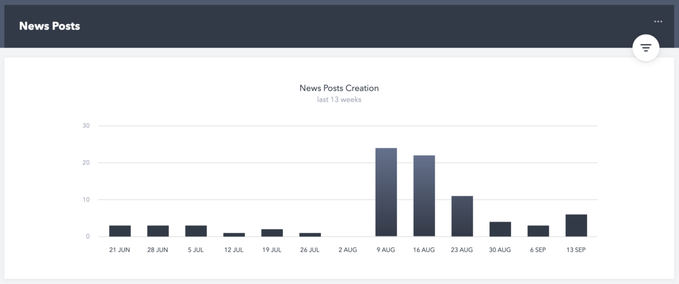
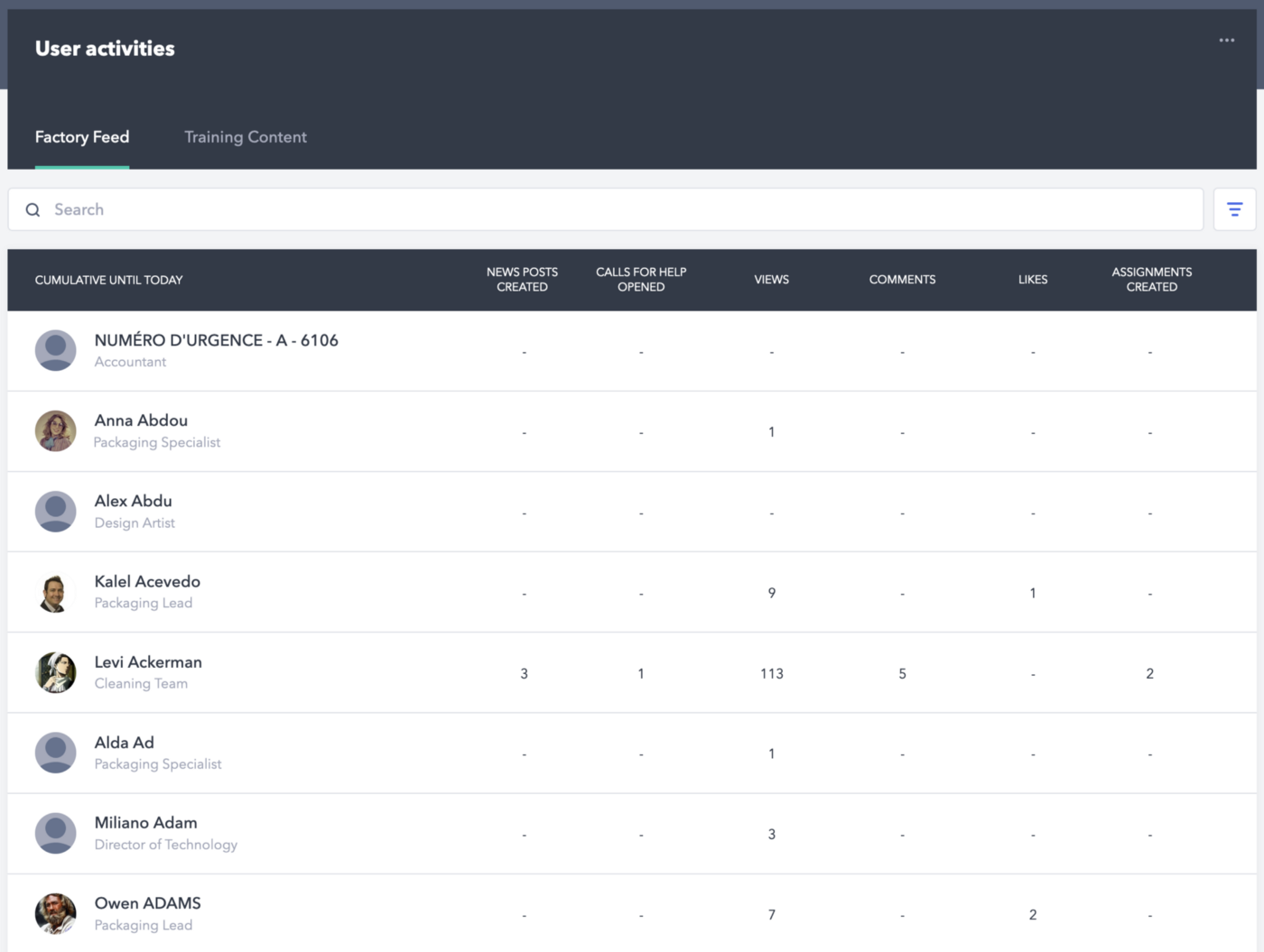
While these two graphs give the Poka’s admins insights on how the app is used, it’s still a bit light in terms of usefulness. It’s not actionable and the user can not interact with the data, change the time frame, or filter it. Plus, it needs to be built from scratch by our frontend developers, which takes precious time.
It was time to update our embedded analytics and make them a bit more modern.
The challenge
How can we move from in-app analytics that are maintained by our front-end developers (and who would rather work on real features) to something richer that can be maintained by a small data team?
That’s the key point: how can we develop interesting and varied analytics for our clients while maintaining them with the same quality standards as our application? By that we mean using development best practices like testing, documenting, continuous development, integration, deployment automation, etc.
There is nothing wrong with quick and dirty analysis, like when someone asks you a random question and you just plot something in Excel or run a SQL query against production data. But we all know that the results may have to be taken with a grain of salt and that in no way this is a viable solution for dozens, hundreds, thousands of clients who will rely on the results to possibly take important business decisions.
The solution we came with is pretty fun — let’s do the same we have been doing with our own analytics, with our current data tech stack, and simply integrate the resulting dashboards in our app. Let’s embed some dashboards in the Poka app!
Modern business intelligence as a foundation
We’ve been building analytics for less than two years and while we’re still relatively new to this, we started right off the bat with pretty cool technologies that could still be considered innovative — let’s say they are still in the spectrum of early adoption.
These technologies are getting known as the modern data infrastructure, well described in this excellent article (https://a16z.com/2020/10/15/the-emerging-architectures-for-modern-data-infrastructure/). To put it simply, it’s a mix of SaaS and open-source technologies that enable us to automate, govern, and version control the whole data pipeline.
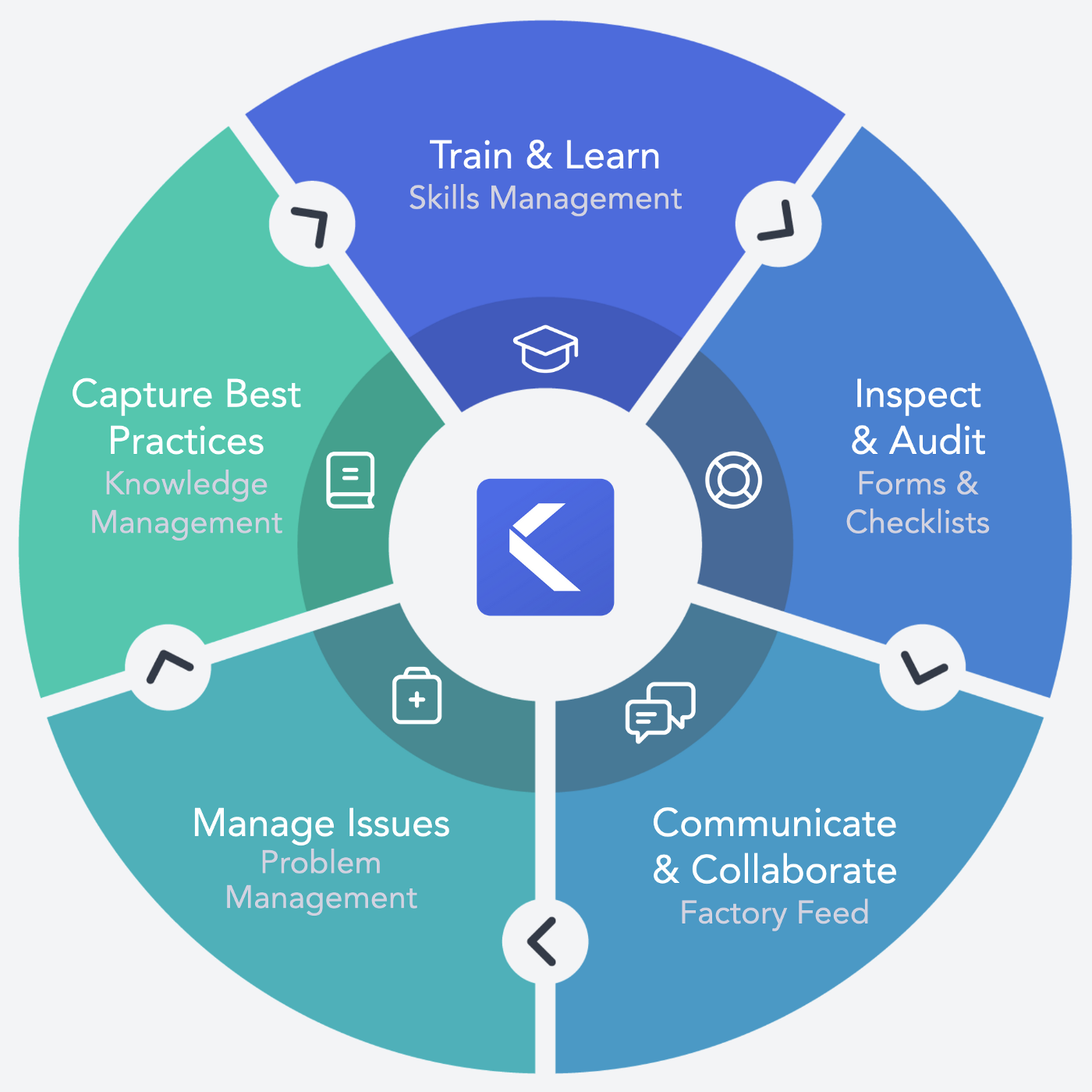
Here is what we’re using.
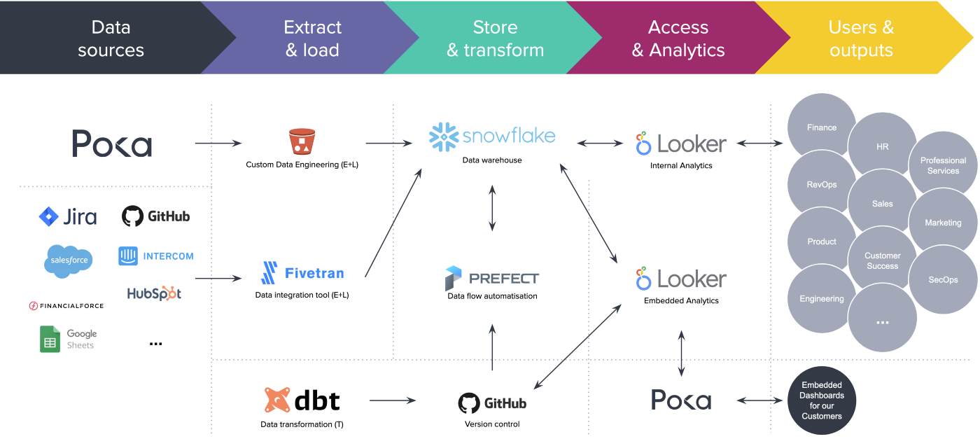
In case you don’t know all these technologies, here is a quick recap of what we’re using for the embedded analytics:
- Snowflake is a cloud data warehouse, super scalable in terms of storage and compute power, in which we store in different databases all our raw and transformed data.
- dbt (for data built tool) is a command-line tool used for our data transformations, documentation, and testing needs. It’s the big T (and L) in ETL and it’s really easy to use for anyone who knows a bit of SQL.
- Looker is used to make the dashboards we embed in our app. However, we use a separate instance than the one for our internal needs because we don’t want to risk that someone does something that could impact the integrity of the analytics.
- GitHub is used for version controlling almost all of the data pipeline including the dashboards themselves — e.g., every dbt transformation is versioned so there’s a control applied to how we transform the data, how we document it, how we test it.
- Finally, Prefect is a cloud scheduler that enables us to automate our dbt transformations and everything that needs to run on a schedule, through Python scripts.
A well-oiled process
The modern business intelligence architecture is a big hint on how we proceed, except we go from right to left. We define what the end goal is, what analytics we want or want to show our users, what kind of business decision they should be able to make with it, and then we build to rest. In other words, what is the result, and what do we need to do to attain this result.
Step 0 — Gather requirements
On a beautiful morning, a product owner will come to ask us, the data team, if we could embark on a journey to create a new dashboard for a feature of our app.
You may not be familiar with Poka but what I call features are simply functionalities, modules in our app, like the factory feed (think like a news feed), forms factory workers can fill out, exams they must take, work instructions they must follow (think work procedures), etc.
We start with requirements that can be a list of graphs and KPIs they would like to show, or better, a Figma prototype. What feature you want to analyze and what type of analytics you want is enough to move to the next step.
Step 1 — Hunt for data
We start by checking in the data warehouse what the raw data looks like, just to get a feel. We haven’t set up data flows for every source we could tap in, like the dozens of SaaS we use, but if it’s data that our app produces, we at least have a raw version available in our raw database in Snowflake.
For the sake of simplicity, we’ll skip the data engineering part where we capture our application data and send it into Snowflake. But I’ll say it involves message queues and S3 buckets to make sure we don’t lose anything. The raw data is extracted daily from our backend databases and once received in Snowflake, it will look something like this.
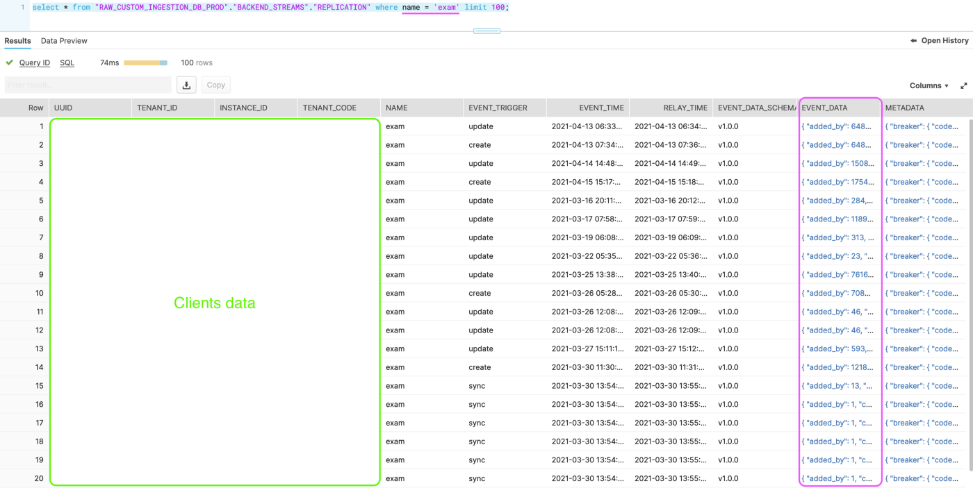
As we can observe, we inject a lot of metadata: the name of the tenant (instance and tenant are terms relative to a client) from which the data comes from, the name of the feature in our app that produced that data, the time at which the data has been relayed from our backend, and the actual payload in JSON (event_data).
Depending on the feature, since the data is extracted as-is from our app databases, the JSON can range from simple to pretty complex nested data. We could easily tap into this file directly from Looker but we still need to clean the data a bit, eliminate duplicates, filter out some fields — all activities Looker can but is not explicitly made to do. At least not like dbt.
Step 2 — Wash and rinse raw data
We now have this raw data and it would be great to transform it into an analysis-ready table, a format that could be easy to use with Looker, or even Excel if you’re brave enough.
dbt works with what’s called models which are simple or complex SQL queries that will be used to read, transform, and write somewhere else your new datasets.
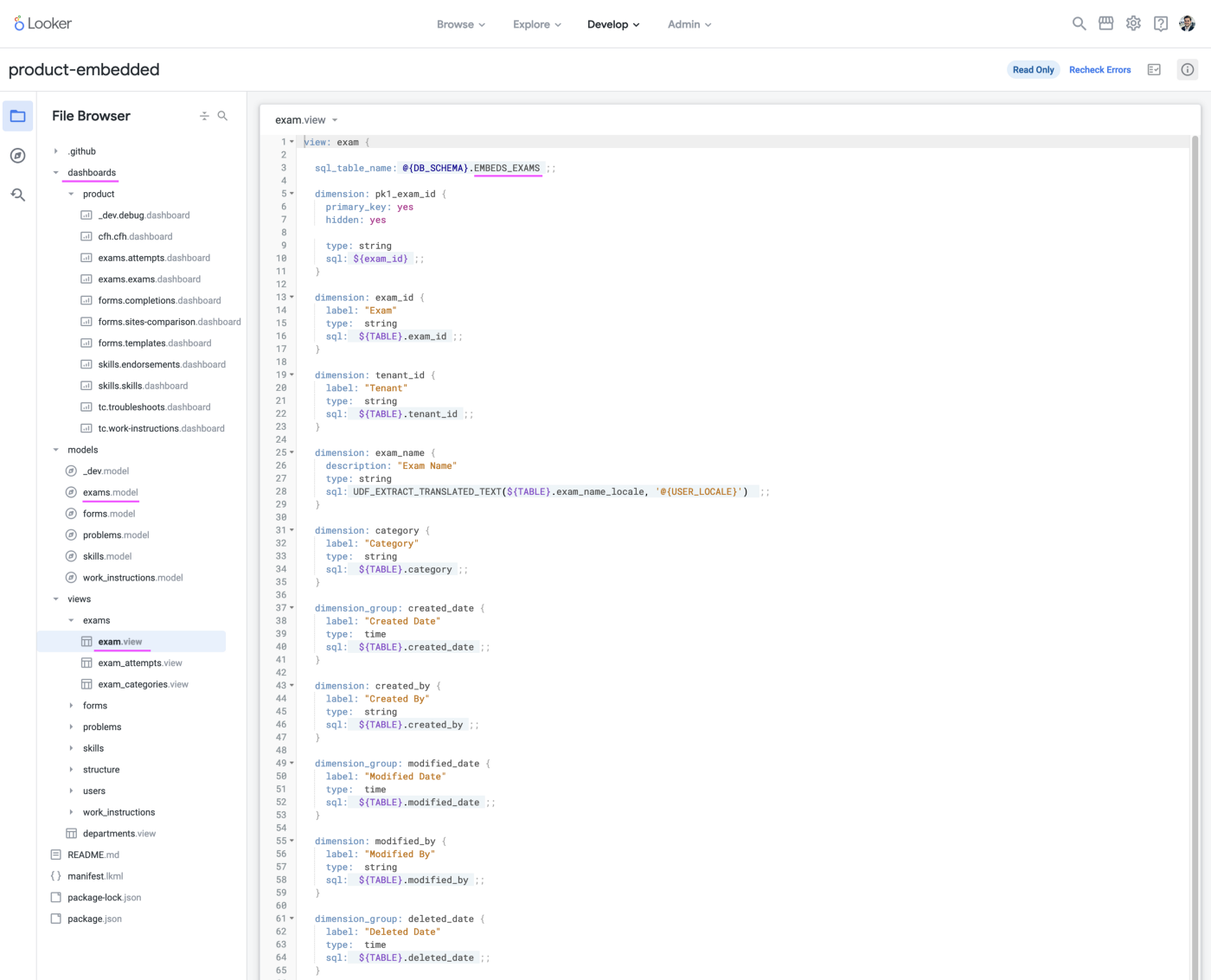
Below is the model we run daily to transform the raw semi-structured exam data in JSON into something analytics-ready, into a real table, ready to use in Looker.
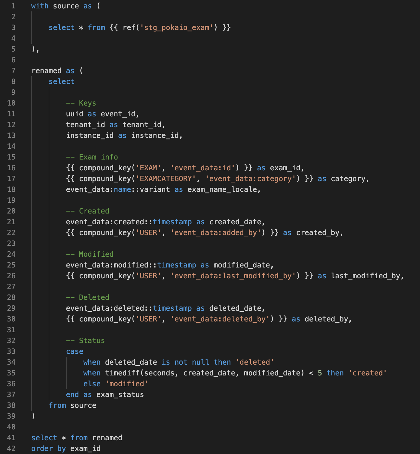
What we see in the above SQL code is that we added Jinja and macros to reuse transformations we use often, like our own compound_key macro made to concatenate strings into IDs. That’s one of the powerful features of dbt.
We then schedule this transformation to run every day once the raw data is updated, so everything stays fresh.
Step 3 — Schedule our transformations
We can schedule our different transformations with dbt Cloud directly or use some of the other SaaS schedulers. We decided to use the data flow manager Prefect since its flexibility lets us run everything we may need in Python. It’s important to note that it’s not Prefect that actually runs our scripts and the actual processing of the data is done in the cloud on our AWS infrastructures (think of virtual compute instances).
The advantage of automatic scheduling is that it’s not dependant on one person running a script on his laptop every morning and if something happens, then we’re screwed. Thank god for cloud stuff.
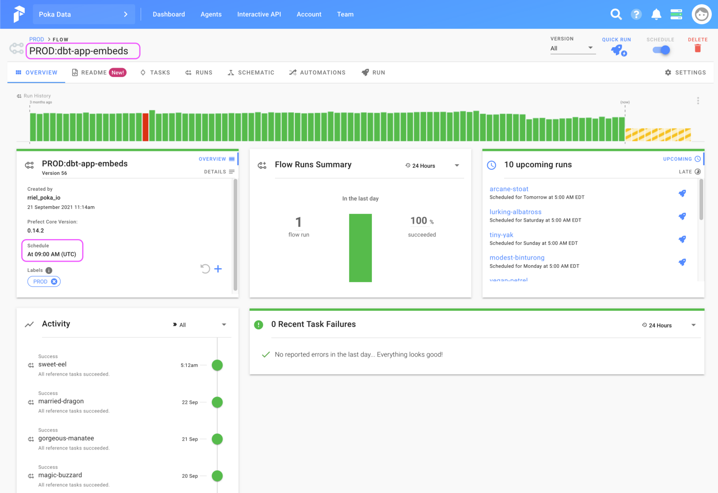
As we can see, we programmed Prefect to run the embedded analytics flow every day at 5 AM eastern time and we have a pretty good success rate!
Step 4 — Building dashboards
We now have access to clean datasets in our warehouse. The next step is to connect Looker to our databases to start building some visualizations.
Looker is a complex but powerful tool that lets you define a project, create the right connections with your cloud database, define tables and its fields, join tables, transform your data if you want to, and obviously create graphs and dashboards. Some people will do their entire data modeling in Looker and it’s valid, but we prefer to use dbt.
Looker could be a tutorial on its own but to keep it simple, since we’ve taken care of the data through dbt and everything is in the right format and ready to be used, the only work besides the dashboards is to create the proper views (in Looker, a view is the equivalent of a table), join our tables together, and add access filters, as seen below.
Once the basic connections are done, we can start prototyping a dashboard by drag and dropping what we want — like any BI tool.
What’s different with our embedded analytics is that once the product owner and the data team are satisfied with the dashboard, we’ll recreate it in LookML, as represented below.
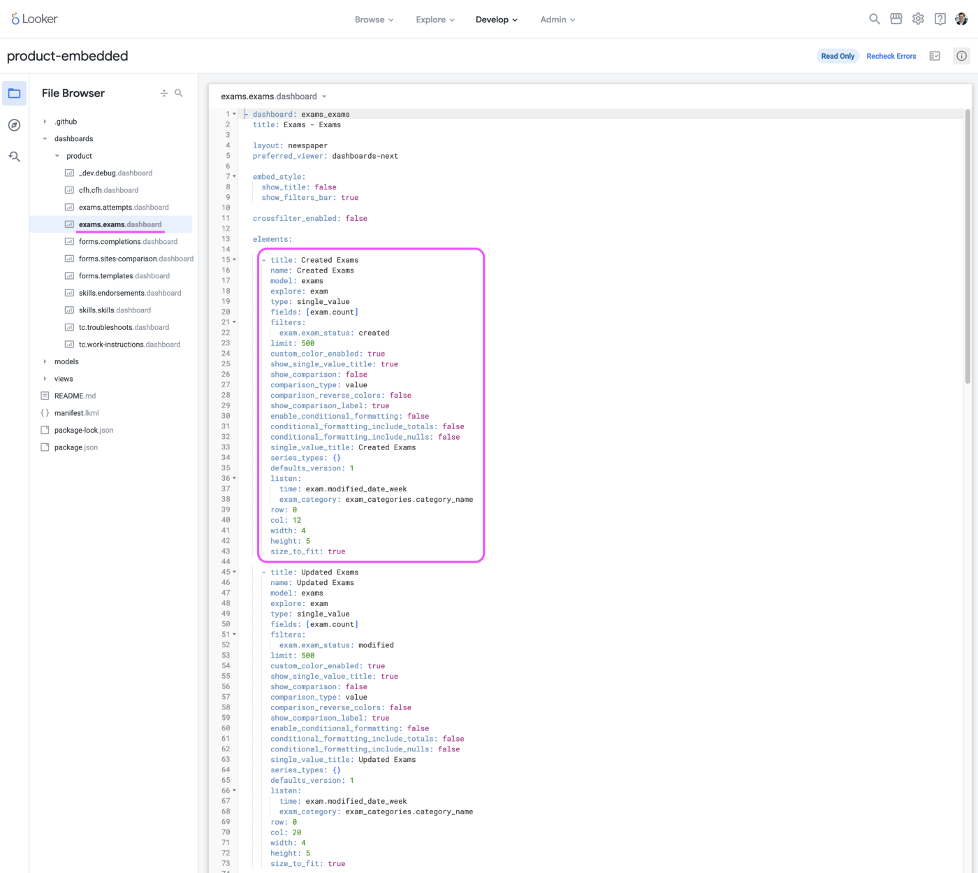
LookML is a markup language used for pretty much everything in Looker: create views (tables), create dimensions and measures, join views, and even create dashboards. In the example above, we created a KPI indicator (called a single_value) and defined every parameter we need: what data to use, that field to use, what we want it to do with the data, the size and location of the indicator in the dashboard, colors, etc.
But why rebuilt it this way, there is no fun in that!
The major reason is code versioning. Everything in our Looker embedded analytics project is code versioned on GitHub, even the dashboards. This is great for governance and the chance of changing something by mistake is pretty low. Another reason we found, later on, is that it’s easier to make sure that our graphs in each of the dashboards are uniform and behave the same; something harder to do in a drag and drop UI.
Step 5 — Enabling the integration in Poka
We don’t need developers anymore (!) but we still need a way to integrate the dashboards through <iframe> inside the app. To do so, we developed a microservice that delivers a tailored menu depending on the app context and the user who’s using the app.
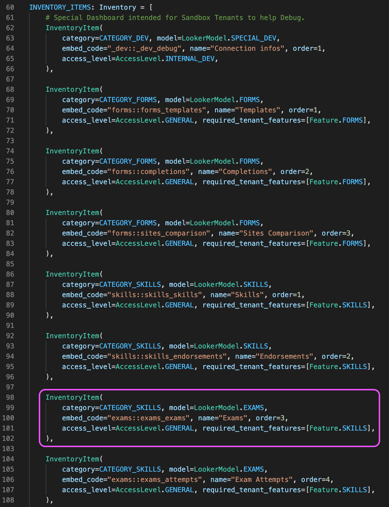
We use the above script to define the name of the dashboards that will appear on the side menu, but also we can decide if the dashboard can be available to everyone or if we want to keep it on certain instances of our app (like the instance we use for quality analysis).
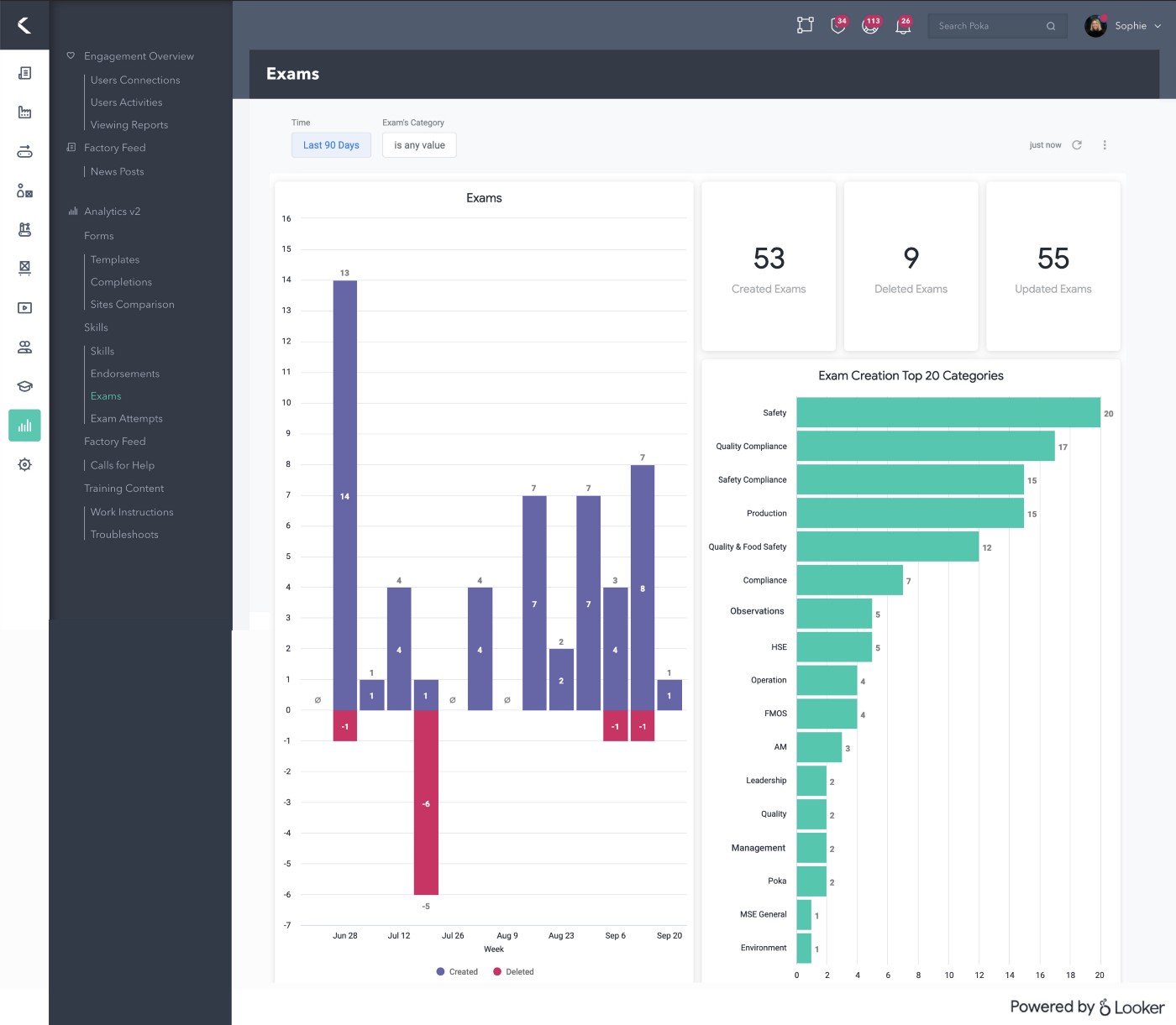
In the end, the embedded dashboards will look something like this, embedded in our app!
What about everything else?
As you may be wondering, yes, there is more than these five steps. There are multiple little things we didn’t talk about for the sake of keeping this kind of short. There are some important points we would still like to discuss below but overall keep, as you know in IT, there is always a lot more going on under the hood, but in our case nothing overly complicated.
Security
Since all of our clients share the same data set (we don’t have one database for each client), through the same Looker platform, we need to make sure they don’t see someone else data. We do so by filtering directly in Looker the datasets bases on the client id.
To put it simply, every time a client looks at an embedded dashboard, the query Looker runs to fetch the data will always have a where clause that makes sure that the tenant_id (the client identifier) is always theirs. We also restrict almost all interactions someone can have with a graph, outside of exploring it, which means it’s impossible to manually modify the queries in question.
CI/CD
What’s neat with the technologies we use is that they are all in the cloud, so the management is simplified, and, as stated earlier, everything is version controlled in GitHub. What that means is that nobody has a tool running on his laptop that takes care of something critical and everything is peer-reviewed.
This practice is not new in the software development world, but in the business intelligence and analytics space, things have always been a bit more liberal. Even in big corporations, it was not unusual to have a guy run an important ETL tool directly from his laptop whit no one reviewing the transformation he defined. Same thing with dashboards and analysis where someone can change the behavior and calculation method of a graph and then simply save it, again, without nobody reviewing it. Think about the classic Excel file full of macros that everyone shares by mail, what a nightmare.
We also added linters to our repositories (there is even a LookML linter) to make sure we don’t introduce errors and keep our code clean, especially everything SQL.
Finally, as seen earlier, we can automate everything with Prefect. Every morning at 9 a.m., Prefect will go fetch the latest version of our code in GitHub, it will then send the scripts to our AWS ephemeral compute nodes which will run the updated dbt models necessary to refresh the data used by the embedded dashboards, and run some data tests. Then, as seen, it will swap the data schemas to make the newest data available. Before that, we made sure to also schedule the ingestion of raw data and any other transformations necessary.
It’s a beautiful ballet.
Blue-Green Databases
When we switch schemas in the database that feed the Looker embedded dashboards, it first goes through a blue-green deployment process. That means that when we run the dbt transformations, two separate schemas coexist for a short time. The newest data will always be written in a separate schema and only once the data tests have been run and are successful — only once we’re sure that we can replace the old dataset — then Prefect will swap the schemas. This way, there is no downtime for our users and we can refresh easily every day. A good introduction to the subject by the dbt folks.
QA
It’s worth noting that we also do extensive quality assurance on our embedded dashboards. Not only is the product owner involved during the development process but as seen earlier, we’ll make the newly developed dashboard available on our testing instances and you can be sure the QA team will test the sh*t out of it. Even the lead designer will evaluate if it’s worthy of releasing to the general public — she’ll make sure we used the right colors.
Takeaways
What’s great with this technology stack is that it’s not far from software development when we look a the process; a software developer would have no problem taking on the role of data or analytics engineer.
More importantly, this combination of tools brings the business intelligence and analytics practice up to standard with software development best practices. We feel that we can trust every step of the process, from raw data to daily updated dashboards, simply because they are automatically run tested and because nothing new is put into production without peer review.
We took up the challenge and since then, we’ve made dashboards on ten different features of our application and we’ll continue to develop new dashboards and upgrade old ones following our clients’ feedback. Like our app, it’s a never-ending cycle of development and continuous improvement. The day we stop doing that is the day we’ll stop bringing value.
In the end, with our relatively short experience with these technologies, we feel like the data and analytics landscape is going in the right direction and meeting the high standards of software development which for sure will bring more confidence and maybe even adoption in the analysis a data team can deliver.
Thanks to Raphaël for setting up and maintaining everything we talked about in this post. Thanks, Laurent, Thomas, Samuel, and Mathieu for your inputs. Sophie for the banner. Finally, thanks to Poka for letting us play with data all day long. ❤️